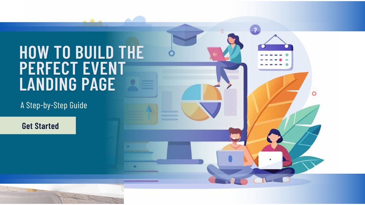
In this hectic era of webinars now, your thoughtful landing page isn’t just handy—it’s a necessity. If you’re presenting a webinar, an in-person seminar, a product unveiling, or a hybrid event, it all starts with your landing page. It’s your virtual business handshake, your elevator speech, your sales team all rolled into one. How do you get it to do its job? Let’s step through the process of creating the perfect event landing page that gets noticed, not just attention-worthy, but also registration-driving, conversion-spurring, and buzz-creating.
What Makes a Great Event Landing Page
An incredible event landing page doesn’t try to do it all. Instead, it’s laser-focused on a single task: getting visitors to take action. That may be registering, RSVPing, or subscribing to news. The top pages are Spartan, distraction-free, and designed to move the visitor from curiosity to action.
Clarity wins. Your readers must be informed immediately about the event, why it matters to them, and what they need to do next. Visual hierarchy is where this comes in—the headline must jump out at you, the copy must sound natural, and the CTA must be clear without screaming. Each piece must reply to the implied question of the visitor: Why should I care?
Types of Event Landing Pages
Not all event pages are created equal. Some are seat-fillers with a focus on speed; others build relationships over the long haul. Being aware of the distinction is essential.
Registration-Focused Pages
These are designed to convert. Always utilise these for ticketed events, workshops, or webinars, and emphasise logistics, value, and price. They feature clean CTAs, simplified forms, and minimal distractions. If you need to drive sign-ups quickly, use this design.
Lead Generation Pages
These are more in the business of constructing than closing. Usually used for pre-launch parties or networking meetups, they are designed to capture contact information for follow-up marketing. These pages might offer a lead magnet—a downloadable guide, for example, or early bird benefits—in exchange for an email address. While conversion is still the end goal, it’s part of an extended sales process.
Step-by-Step Guide to Building Your Event Landing Page
It doesn’t cost a massive budget or design team to create a killer landing page, but it does require strategy. Here’s your map:
Step 1: Define Your Goal & Audience
Define first before you start designing. Are you selling tickets? Creating leads? Building brand awareness? Define the goal and then craft the content with the motivations, concerns, and expectations of your target audience in mind. This will inform everything from tone to imagery.
Step 2: Choose the Right Platform
Depending on your technical abilities, you can use platforms like Mailchimp, Cvent, or Splash, or even make custom pages on WordPress or Webflow. Some platforms offer drag-and-drop editors with event-themed templates to simplify it. Some have full-scale customisation for advanced marketers.
Step 3: Craft a Killer Headline & Subheadline
Your headline is your hook. It needs to tell visitors immediately what the event is and why they need to care. The subheadline should reiterate the message of the headline and add a bit more information or a sense of urgency. Make it short, benefits-driven, and straightforward. Confusion kills conversions.
Step 4: Design an Engaging Layout
Visual design can make or break your landing page. Use a layout with a natural flow of the eye: headline, benefit copy, imagery, form, and CTA. White space is your friend—leave your content some space. Save your brand colours for call-out buttons and key points only.
This is where event landing page best practices really earn their keep. The best pages, in the opinion of marketers, combine clean design with intentional visual use, hierarchy, and focused content that supports your conversion goals.
Step 5: Write Persuasive Copy
Now that your design is clean, it is time to make it compelling. Your copy must directly communicate the value of the event: What’s in it for the attendee? Use active voice, short sentences, and eliminate the fat. Generate scarcity through limited-time and limited-access offers. Talk directly to your audience’s needs and wants.
Step 6: Optimise the Registration Form
Less is more. Don’t overwhelm users with too many fields—each question decreases your conversion rate. Name, email, and maybe a one or two-question qualifier will suffice for most events. Employ smart form logic when required, and clearly state any fees or next steps on form submission.
Step 7: Add Strong CTAs
Your CTA button has to be impossible to overlook. Use action verbs like “Reserve Your Spot,” “Join the Waitlist,” or “Get My Ticket.” Make the button colour contrast with the background and place it in a few spots around the page. A limp CTA is one of the most common—and costly—missed opportunities.
Having prominent CTAs is a cornerstone of a high-converting event page. You don’t desire your viewers to be uncertain of what to do next. Give them an obvious call-to-action—and a reason to do it now.
Step 8: Include Social Proof & Trust Factors
Be trustworthy, and people will trust you. Include testimonials, past attendee reviews, media mentions, or logos of well-known partners or sponsors. If it is a recurring event, showcase photos or videos of past events. Trust indicators eliminate scepticism and establish credibility.
Step 9: Optimise for SEO & Mobile
Don’t forget discoverability. Use relevant keywords naturally in your headings, alt tags, and meta descriptions. Your page should load fast and be fully responsive on mobile. Over 60% of traffic now comes from phones, so if your page isn’t mobile-friendly, you’re losing potential attendees.
You’ll also want to keep in mind some event registration page tips, like reducing mobile form length, auto-filling user data where possible, and ensuring your CTA is sticky or always visible as users scroll.
Step 10: Integrate Analytics & Tracking
Software like Google Analytics, Meta Pixel, or HubSpot for tracking is a must. They tell you where folks are coming from, what they’re clicking on, and where they drop off. Use it to improve your campaigns and your conversion rate as time goes on.
Set event-specific goals, track registrations, and build custom audiences for retargeting. The more data you collect, the brighter your marketing gets.
Must-Have Features for High Conversions
While good copy and design form the basis of your event landing page, there are some ingredients that can really put your efforts to turn visitors into attendees onto a turbocharged plane. These tools leverage psychological motivators like urgency, social proof, and ease of sharing—daunting ingredients in making your page perform better for you.
Early-Bird Discounts
Who doesn’t love a deal, and early-bird discounts appeal to this mentality. Offering a discount to an individual who commits during a specific time range allows you to encourage instant choices. This not only gets you started ahead of schedule with your campaign, but it also gives you a clearer idea of how your event will be received. Emphasise the cut-off date and consider putting the full price alongside the discount price to show the savings.
Share Buttons for Virality
Word-of-mouth is likely the most powerful marketing force, and in today’s world, sharing on social media is its equivalent. Having share buttons (for sites like LinkedIn, Facebook, Instagram, and X) allows attendees to easily share. You can even make it that little bit extra by pre-populating the share text with a teasing message or reward. While this won’t guarantee virality, it lowers the barrier to entry and turns every registrant into a potential promoter.
FAQ Section
No matter how clear your landing page is, visitors will have questions. Including a well-organised FAQ section not only anticipates their concerns but also builds trust by showing that you’re prepared. Address common issues like refund policies, access logistics, how to join virtual sessions, or dietary accommodations for in-person events. Use simple, common language and craft your questions so that they reassure, not overwhelm. It’s an assertive yet inviting way of slicing through the psychological hurdles between your visitor and your sign-up page.
Tools & Resources to Build Your Page
Hiring a pro, high-converting event landing page can’t necessarily mean breaking out the chequebook for a developer or taking out an expensive design agency. With what’s offered these days and no-code websites, anyone can make a page that’s lovely to look at and converts well. The key is finding the right tool for your event goals, your budget, and your level of technical capability.
Mailchimp
Although traditionally most well-known for email marketing, Mailchimp is now a comprehensive marketing system with an easy landing page builder. It’s especially awesome if your event promotion is going to be email-based or if you want to speed-segment and cultivate prospects once they’re subscribed. With Mailchimp’s drag-and-drop functionality, as well as native integration into your email campaigns, it’s a smart choice to begin with for small teams and those starting out.
EventBookings
For more active or larger-scale event planners, EventBookings offers a professional event planning suite of tools, including landing pages. Its templates are prepared for registrations and logistics information, with RSVP management, waitlists, and tracking of attendees built right in. EventBookings also includes advanced analytics, where you can discover not just how many dropped by to see your page, but where they came from, and what they did.
Splash
If visual branding is top priority and you want your landing page to be an attractive force, Splash is an option. Its focus on event marketing provides design capabilities that enable you to create clean, on-brand pages without the need for a designer. It’s also ideal for hybrid and virtual events, with streaming features integrated right in and real-time analytics. Splash excels at balancing form and functionality—perfect for designers with a passion for data and marketers.
Final Thoughts
It seems building a performing event landing page is more about understanding your audience to the core and less about throwing something together, shortening the path, and building trust along the way. With proper structure, design, copy, and features, you can build a web space that inspires, informs, and persuades.
And don’t overlook, in this attention-competitive world, that a memorable, easy-to-use, and action-oriented page can be the distinction between a full house and an empty house. The art of the landing page may require some time to learn, but it’s one of the most helpful skills any event planner in the current world can learn.
Whether you’re planning your next big launch or simply refining your strategy, use this guide as your compass—and watch your event landings soar.